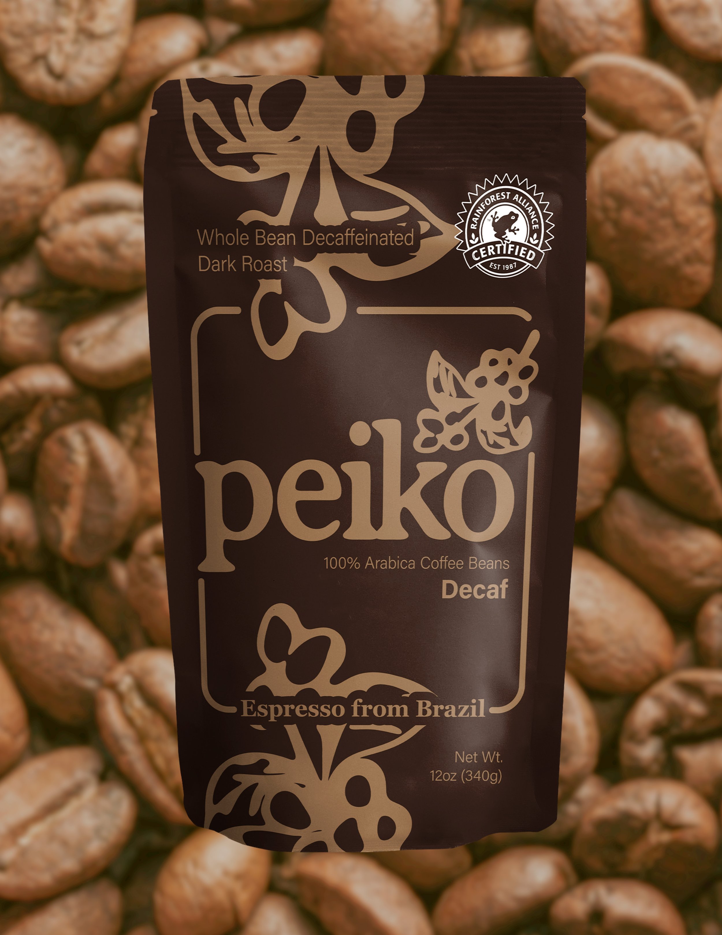
I created Peiko to be an espresso brand grown in Brazil.
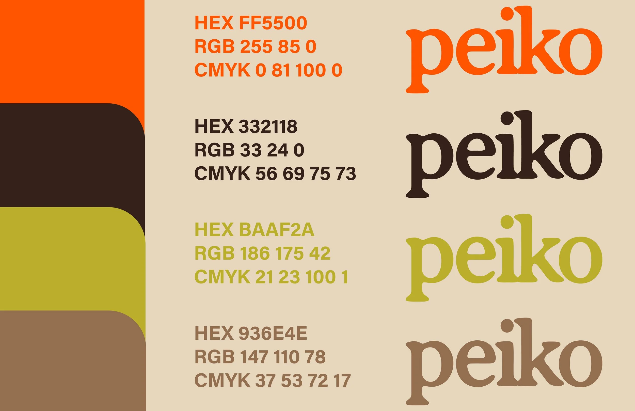
The name Peiko means "you are the one" in the Guarani language of Brazil. A core concept for the branding is to call back to the roots of where these espresso coffee beans are grown through the motif of the coffee bean plant. It is also present in the color palette, which is rich and bold, creating a feel of nature. The imagery used in the ads grounds the palette by creating the illusion of a “golden hour.” It is intended to feel very warm, and sunlight soaked.
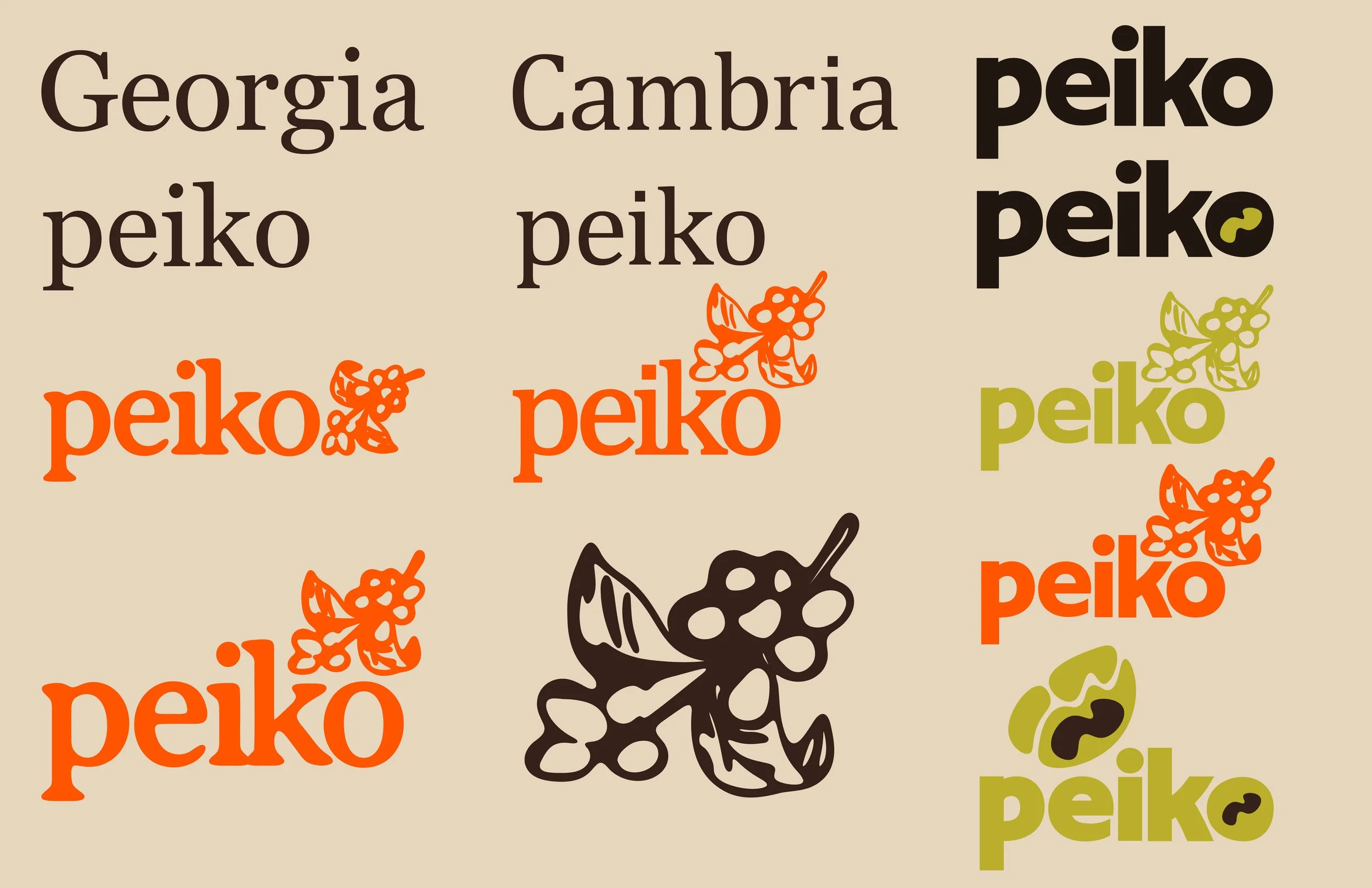
I chose a typeface with serifs because it felt more grounded and natural. I combined the letter “P” from Cambrias font with “EIKO” from Georgias font. I thought the Georgia font fit the look I was going for, but the “P” was too sharp. I tweaked the font to make the edges and corners more round, so that it could feel like it was worn by nature. I then added a logo that could be combined with the wordmark to make a logomark. The logo is of arabica coffee beans to show the origins of the brands beans. The colors are inviting and so I wanted the logomark and wordmark to match.