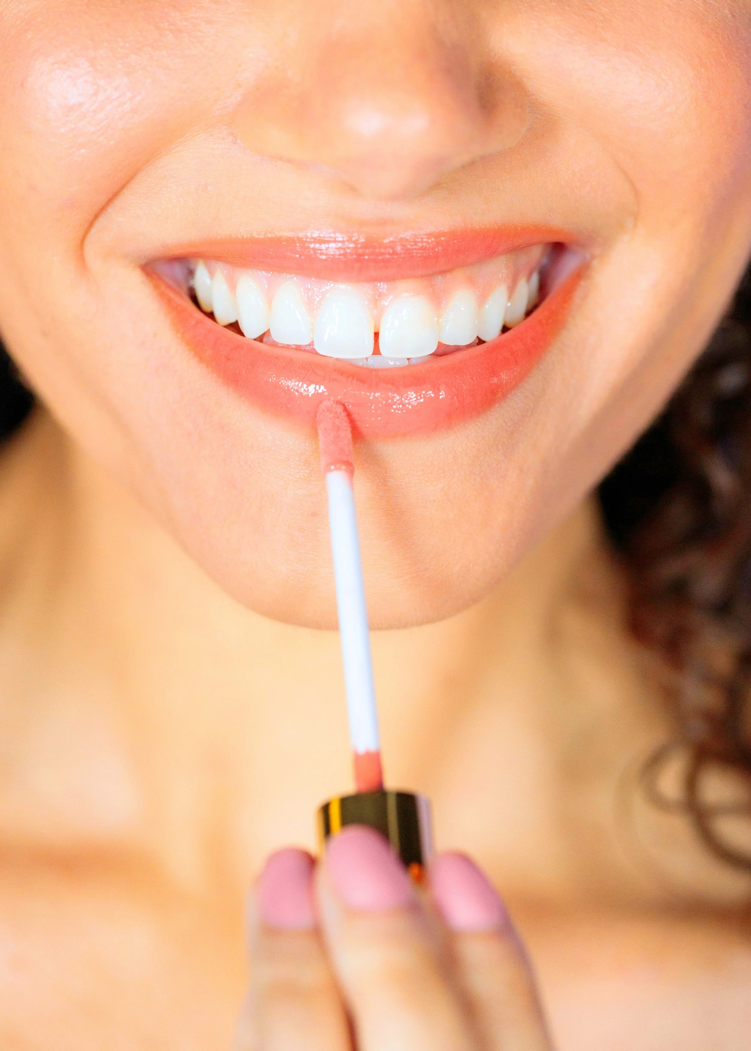
I created Celka to be a cosmetics brand that specializes in simple ingredient beauty. Celka aims to provide products that allow people to embrace their natural beauty.
Celka is up for two ADDY awards!
Celka’s name is inspired by the word “Selca”, a Korean and English fusion word for “selfie”. This is a subtle call to the overwhelming success that has recently taken over the Korean skincare market. It also shows the foundation principle of the brand to think of the people who will use their products first. Care for yourself with simple ingredients. Show your natural beauty. Show yourself. It’s simple.
I started this project on the name, and wordmark. I created a font that was simple and clean to allude to the ingredients. The subtle curves makes it feel young and speaks to the target audience of Gen Z and young Millenials. The color palette followed the wordmark. I wanted the colors to appeal to this market and still stay minimal. They all fall into a warm tone that is bright and inviting. The colors are feminine and vibrant. They look as fresh as Cekla wants its customers to feel when using their products. This vibrant and bold look inspired the motif of a flower that would find its place in Celka’s packaging and overall art direction. Celka is bright, inviting, sunny, and fresh. It has a minimal design that focuses on the promise of simple.
Celka’s packaging is an extremely important element in the branding. I did not want it to be boring, so I used AI to make custom packaging. This process took a long time to fully figure out, but the results made the brand feel whole. I first started in Illustrator, and created a really basic outline of the different elements I wanted the packaging to have. I wanted a flower motif on the lids and wands of the products. I gave Firefly a few prompts and cycled through styles until I found the foundation photos I wanted to work with. I then took the photos into Photoshop to clean up minor packaging details, fix lighting, expand the canvas, and alter the colors of the products and background to fit Celka’s color palette. Next, I took the photos into Illustrator and mocked up Celka’s word mark, along with some minor product details. This entire process allowed me to achieve this packaging, which is unique to Celka.


